Type (Part One)

Take 26 letters. Turn them loose with creative people. The result will be typography which consists of letters called fonts. With the advent of computers, a vast variety of fonts is now available. My husband and I spend many enjoyable hours pouring over and selecting fonts for our printed projects. The English language may have a mere 26 alphabet letters, but the variety of fonts knows no limits.

The myriad of fonts can be grouped into four categories. Serif fonts are the oldest. Known by the little “feet” at the bottom and top of each letter, serifs originated “in the flick of a calligrapher’s wrist.”

The second group of fonts is Sans Serif or no serif. They are the no nonsense, easy to read workhorses of print. Helvetica, a Sans Serif face, is the most popular font in the world.

Script or Cursive fonts make up the third group. They mimic handwriting with their elegant ornaments and swashes.

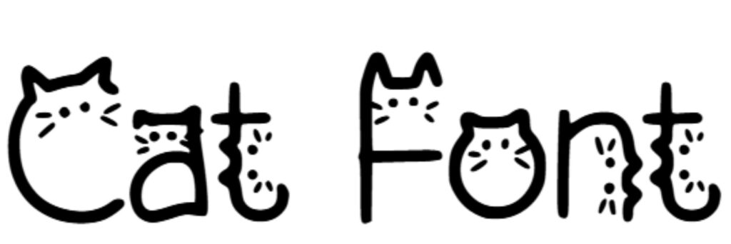
The fourth group consists of Decorative or Display fonts. They are created from pieces of the other three groups. Decorative faces are loaded with personality and scream for attention.

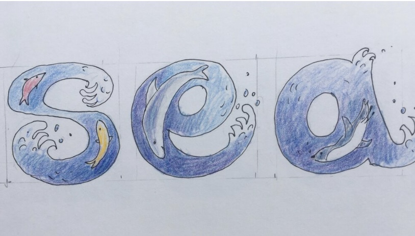
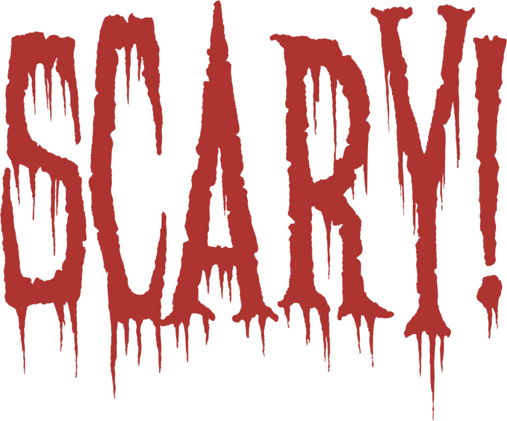
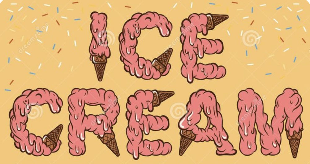
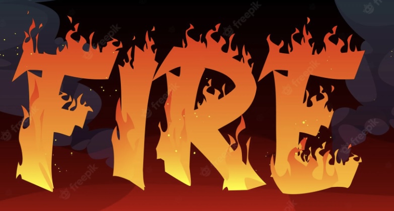
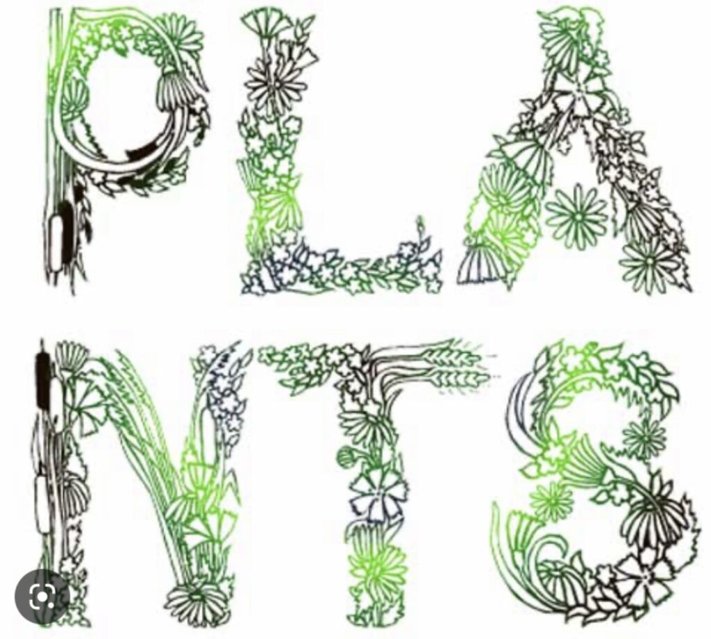
Now it’s time to have some fun with the fonts. No English word exists for type that mirrors the meaning of its content. The Dutch do have a word, letterbeeld, which translates to “letter image”. (Words that sound like their meaning are called onomatopoeia.)

After viewing the following examples of letterbeeld you may be inspired to conjure up some of your own. Enjoy!

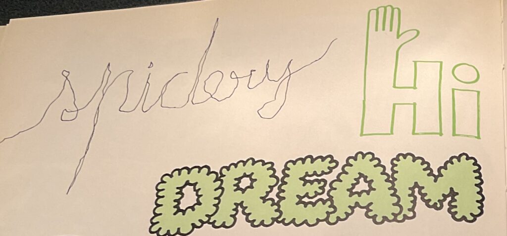
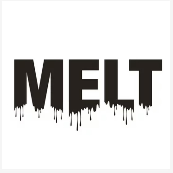
The following examples are all by children… and they are my favorites.


5

Comma

More of everything is considered a good thing in our American culture. If one house is good, two or three must be better. A Big Gulp soda is thought to be superior to an eight-ounce drink.

Being a minimalist, (except for cats and books), I don’t see the logic in “more is better”. I’m strictly a “less is more” person. My thinking in this vein extends to commas. I get livid about the Oxford comma.

My venom toward a tiny punctuation mark may seem absurd. But this particular use of a comma is redundant in almost every instance. It totally disrupts the flow of any piece of writing and should be banished as a pretentious waste of time, space and ink. I refuse to use it and subject any reader to such a travesty.

The Oxford comma is the little rascal that is inserted before the word “and” in a series. For example, “Mary likes cats, crows, and caterpillars.” In my opinion, if writers have a desperate need for that comma, they should leave out the word “and”.

I recognize that in rare instances the Oxford comma is needed. The following sentence is absurd without it. “I owe my success to my parents, Albert Einstein and God.” I trust we are all intelligent enough to recognize these instances and act accordingly. And if we are not intelligent enough, we will merely inject a bit of humor into the world.

Despite being named after a British university, the Oxford comma is not standard usage in U.K. writing. Most British writers only use it to avoid ambiguity. The Oxford comma is an American affectation.

On this side of the ocean, the comma does have its detractors. The New York Times Stylebook, the Associated Press Stylebook and the Canadian Press Style Guide all advise against its use. Many acclaimed authors do not litter their pages with it.

I intend to remain firmly on the side of those who do not want the beauty of the written page to collapse under the weight of superfluous commas. Those nuns in grade school taught me well, and I listened.

2

Buttered

I never thought butter could be evil. But butter in Wisconsin went rogue recently. Fortunately, no one was injured in the incident. The meltdown started at 9:00 PM on January 2 when flames started shooting out the roof of the Associated Milk Producers plant in Portage, Wisconsin.

Portage is a historic town where Native Americans, French explorers and early settlers portaged their canoes between the Wisconsin River and the Fox River, a distance of two miles. Between 1849 and 1851, the townspeople attempted to hand dig a canal between the rivers but gave up, letting the Army Corps of Engineers do the job which was completed in 1876. The Portage Canal linked Lake Michigan to the Mississippi River. It is currently on the National Register of Historic Places. The butter and cheese factory is adjacent to the canal.

The fire at the dairy plant started in the room where the butter was stored, and the butter soon flowed throughout the plant as it melted. The Portage fire chief reported, “When we first tried to go up the stairs to that part that collapsed, this stuff, the butter was running down like 3 inches thick on the steps so our guys were up to their knees trying to go up the steps to get to the top and they’re trying to drag the hose line, the hose line got so full of butter they couldn’t hang onto it anymore.” Ten other fire departments were called in to assist, but the river of butter just kept flowing, some of it exiting the building into the Portage Canal.

A hazmat team was called in to clean up the mess in the canal. They treated the situation the same way an oil spill would be handled, by using absorbent booms. Thanks to their actions, the canal was successfully unbuttered.

The fire was contained in the dairy plant as well, taking a heroic six hours of work by the firefighters. The city of Portage no longer smells like burnt butter, but the story of the runaway butter probably will be told for years to come.

5

Barns

In a recent conversation with friends, an interesting question was raised; Why are barns painted red? None of us knew the reason, and I volunteered to search for the answer.

An article from Live Science best sums up the reason why red paint rules…convenience and frugality. Here’s how it all evolved.

The earliest farmers in New England didn’t have money for paint and most barns weren’t painted. But unprotected wood did not fare well during harsh New England winters. By the late 1700s, the farmers began experimenting with making their own paint. The most successful concoction turned out to be a mixture of skimmed milk, lime, linseed oil and red iron oxide (rust). The iron oxide was readily obtained from the red clay in the soil. It not only sealed the wood but also prevented fungus and moss from growing on the boards. Wealthier farmers sometimes added blood from slaughtered livestock to make a darker red.

By the late 1800s, commercial paints were becoming available. The red barn paint was the most popular color, continuing the tradition of the bucolic red barn. It was called “Venetian Red” after an ancient pigment made from the red soils near Venice.

The 1922 Sears Roebuck catalog sold red barn paint for $1.43 a gallon. Other colors were $2.25 a gallon making red the cheapest option. Today’s price is about $16.00 a gallon. Compared to the price of house paint, it is still a remarkable bargain.

Of course, every barn in America is not painted red. White is the second most popular color. In the earliest years, farmers simply whitewashed the barns. When commercial white paint was developed, it was expensive and loaded with lead which caused serious health risks.

Kentucky is known for its black barns. These barns are used for drying tobacco leaves. The black color raises the heat inside the barn and aids in drying the leaves. The creosote in the black paint has the additional bonus of repelling termites.

Sadly, the iconic red barns with their companion domed silos are fast fading from the American landscape. Sprawling corporate farms are replacing the barns with industrial metal warehouses for cows. The family farm with a red barn as its centerpiece will soon be history. The only red barns left will be the miniature ones in children’s toy farm sets.

4

Naptime

I remember it vividly…lying on a rug, my eyes wide open. And I’m wondering why a big person is telling me to take a nap when the sun is shining and the room is filled with art supplies and books. This is my most vivid memory from first grade.

My mother, on the other hand, figured out when I was two that I didn’t need or want a nap. To this day, naps have remained a nonexistent part of my life.

Even though I am not a napper, my attitude toward naps has changed. This is because I live surrounded by ten champion nappers.

My husband is a nap specialist; anytime, anyplace, anywhere. A quick ten to twenty minute catnap and he is good to go. I quickly realized this ability is a remarkable gift. For example, we both love taking road trips, always sharing the driving. He usually chalks up several naps while it’s my turn at the wheel. When I am in the passenger seat, my eyes are wide open checking out the scenery or reading a book. My body refuses to sleep during the day or when I’m in a moving vehicle.

The nine other nappers in our house have raised napping to an art form. Felines both small and large, tame and wild, spend an average of fifteen to twenty hours a day sleeping. Science reveals several reasons why cats are such superb sleepers.

First, they are classified as crepuscular animals, i.e., they are most active at dawn and dusk. When hunting (and they are all hard-wired to hunt even if we are dishing up the tuna), they avoid predators in daylight and deep night hours.

Second, cats in the wild expend enormous amounts of energy hunting and must rest up after the chase. The instinct remains in our house cats. The other day, I watched our cat Shrimp chase his tail, dump out his toy basket, bat his balls around and kill his toy mouse. Then he flopped down in the middle of the kitchen for a good snooze.

A third reason for cat naps is temperature regulation. Cats evolved in and adapted to hot climates. They’ve learned how to conserve energy and stay cool by taking frequent siestas.

And finally, scientists speculate that cats sleep a lot simply because it is pleasurable. Yesterday, I was sitting next to our big ginger cat, MacGregor, as he dozed off. A few minutes later, he was sound asleep and loudly purring.

I truly wish I could take a little cat nap now and then, but it’s not in my DNA. Here are some lessons from the experts.


5