I’m a lover of letters, i.e., typefaces and fonts. Serif, sans serif, bold, condensed, gothic, italic…letters display a stunning array of personalities.
I did not, however, think that a typeface could be the inspiration for a building design. But recently this has been done, and the result is a brilliant success.
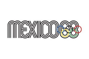
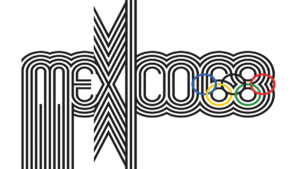
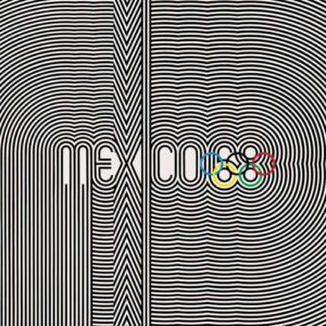
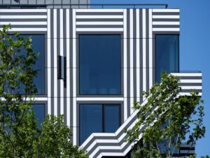
The typeface in question was created by Lance Wyman for the 1968 Mexican Olympic Games. Called “Mexcellent”, it is based on forms from ancient Mexican culture as well as op art and kinetic designs.
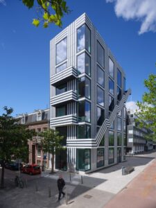
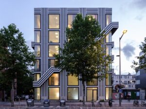
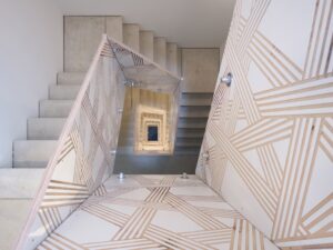
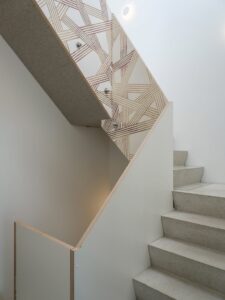
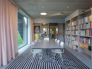
In the late 1980’s, a graphic design firm in Amsterdam named Thonik decided to build their own studios rather than being eternal renters. The design and construction of the company’s headquarters ended up taking twelve years, and it’s facade and interiors are a giant homage to the Olympic typeface.
Nikki Gonnissen, one of the founders of the firm states, “We are big fans of the Mexico ’68 Games because it connected a massive audience to graphic culture.” Her partner, Thomas Widdershoven, further says, “We are amateurs in the sense that we are not professional architects, but we’re also amateurs in the sense that our heart and passion are in this project.”
That passion is evident in this joyful building, in essence, a typeface on steroids.
0
How cool is that!!!!
Oddly enough – one of my fave fonts for my METROPOLIS graphix is entitled; Bauhaus. And there is a certain similarity to the Mexcellent font – the rounding-flow.
I love all the various typefaces you use in your videos…..and I know you put thought into their selection.